Illustration

Illustration

This body of work explores Afrofuturism through black and white line illustration.

The focus is on form, symbolism, and identity by stripping color away to emphasize structure and intention.

These illustrations exist as authored pieces, developed as part of an evolving visual language rooted in futurism and heritage.

This work is ongoing.

Portfolio

Editorial Fashion Photography Portfolio

This portfolio presents a curated selection of editorial fashion work created in collaboration with models, designers, and creative teams. The imagery prioritizes form, expression, and visual cohesion, balancing concept with restraint. Each project reflects a focus on intentional lighting, styling, and narrative, allowing the work to stand independently while remaining adaptable across platforms and publications.

Events

Event Photography for Corporate & Cultural Events in NYC

I photograph events with a documentary-forward approach, focusing on real moments, interaction, and atmosphere as they unfold. From corporate gatherings and cultural programs to private and lifestyle-driven events, the goal is to create imagery that feels cohesive, unobtrusive, and purposeful. Based in NYC, my event work is designed to support marketing, archival, and storytelling needs without disrupting the natural flow of the experience.

Portraiture

Professional Portrait Photography in NYC

My portrait work centers on individuals, couples, and professionals seeking imagery that feels natural, composed, and representative. Whether created for personal branding, agency use, or business applications, each session is approached with attention to presence, pacing, and subtle direction. Based in NYC, I work with clients who value portraits that communicate confidence and clarity without feeling staged or performative.

Lean IX

.Lean IX

Documenting a company and their journey can be a daunting task. Key words “can be”. But they do not have to be. When approaching me to cover Lean IX’s NYC leg of their 4 leg tour, I immediately go to work. You have to know your client, what they stand for, and what they may be expecting from you. This is how I approach all clients. it is vital in figuring out the how of what your client will want from you. How means everything. Likewise, knowing how means you are aware of the steps that lead to the end goal. For Lean IX, this is documentation of a huge undertaking.

The Issue

Most events like this always take place inside a hotel or some large hall. The biggest issue with these is color correction. Any photographer knows that covering content that involves florescent bulbs will require a bit of white balancing. In this particular instance, I am responsible for covering two floors worth of content with 3 different styled areas of lighting. I adjust for every specific area, but in most instances, allowing an auto white balance would be key. Most people who work in editorial/photojournalism or event photography are aware how tedious it can be to do things without any auto assist. Everything moves very fast, but I love keeping a consistency with my work where if at most, I can adjust one image and apply the changes across the board.

End of The Day

With all things done, my duty is to supply the company with mid day images as promotion to virtual attendees, while a post day submission is another requirement. However, I am supplying the full gamut of images The company will utilize these for additional marketing. It’s a great thing to get used to as it helps you speed up your production process. All in all it was a great day.
Click Editorial to see more of my Editorial/Photojournalism work

Click Instagram and Youtube to check out my content

Nay Marie of Adorned in Taji

NayMarie of Adorned in Taji

Shooting with Nay Marie of Adorned in Taji never disappoints. The style and energy she brings to a session is always perfect. Every now and again we have a sit down to create a new set of headshots and portraits for her. The reason we do this is that her looks and branding changes frequently enough that we need to keep things fresh. Noone likes an image that represents an old version of themselves they no longer connect to.

Freedom of Choice

When working with Nay Marie of Adorned in Taji, there are only ever two requirements. 1. We have to make sure that they are a visual representation of her essence/personality. 2. The jewelry she makes has to be a highlight of some magnitude within the images. You will see that Nay wears a very beautiful set of complementary adornments. They connect in multiple places but always bring a beautiful aesthetic to the images. What we do is develop creative headshots that will allow the use of hands and movement within the images. The lack of movement would otherwise place this in a more standard headshot zone, which is not Nay Marie. Because of this, I have full freedom of choice to direct and capture how I see fit.

Nay Marie To Scale

The last important factor is making sure that Nay’s Crown aka her Hair, is shown just as prominent as her adornments. In this session we are working with her FroHawk which stands very high and very expressive. It is something you cannot hide, nor should you want to. Just note, if ever capturing someone with a lot of hair that is or starts vertically, this will place the facial plane a little lower in the composition. Understanding this and executing a balance is very important as can be seen in our final images.

Click Headshots for more of my work

Follow me on Youtube and Instagram


Caleb Headshots

Caleb Headshots

One of the benefits of attending various conferences is that you connect with models and other creatives. It just so happened that this particular person was a reconnect from a previous era of me doing behind the scenes work in dance. I became connected with quite a few people and these Caleb Headshots were no different. Caleb actually found himself as one of the models used for the B&H Depth of Field event. This event is earlier in the year at the New Yorker Hotel. Under 208 Management Caleb would work various locations within the space posing for various photography.

Headshots

You can choose quite a number of ways to shoot headshots. Despite what people may say, there isn’t one right way to do it. Despite there not being one right way, there is still a standard to meet for quality. In general one should always choose a full on or 3/4 pose for your subjects. Always find their good side and cater to that. If the person needs to be slimmed down a bit, always turn their face/body away from the camera so as to cause a foreshortening affect.

Lighting

In most instances headshots are taken on some form of white background; however, there are some of us that like to spice things up and change the atmosphere. Depending on the field in which my clients are, the background will switch. For these shots you will notice that the background is black. There is nothing wrong with that, in fact it’s a preference. The only issue that can arise is that this particular backdrop blends to easy with his clothing. When you have situations like that you have to position your lights in such a way that it will cover the areas that may be a problem. This in particular was a one light setup. Using a beauty dish and eyelighter reflector in a clamshell manner, we were able to illuminate both Caleb’s face, edge of his hair, and clothes. Particularly important since, as you can see, everything is black.

Click to see more of my Headshot work

Want to see more of my work, Check my Youtube and Instagram


Hannah Headshots

Hannah Headshots

One of the most intricate journeys you can embark on is that of headshot work. And, if you want to step the difficult level up even further, you can make things increasingly harder by working with children. Now, children are very temperamental so you have to be wary with how you approach things. I always suggest that you get to know the child with some conversation and then build out a comfortable rapport. That is how I produce these Hannah Headshots.

Conversation

When speaking to children, we have to remember that we were one at some point in our lives. Adults forget children are the same at their core, and as a result, we must find a common ground interest. In this particular session, I ask Hannah of some of her favorite shows. The first show she uttered was “Buffy”. Turns out her Father would watch the original “Buffy the Vampire Slayer” series and they, Hannah and her sister, would watch it with him. And with that, I find my common ground.

Instructing

Now that I have my common ground I am able to utilize characters and information from the show to have her mimic. Mimicry allows for a wide range of emotions, which can be crucial in acting and showing the breadth of your capability. Hannah was so good that even her younger sister was ready to show what she could do. With Hannah, I would say, give me your favorite character from the series and emulate them, she would then in turn show me anger, rage, confusion, happiness, etc. Even not referencing the show “Buffy”, I was able to tap into general emotions. Asking a question like, let’s pretend you wanted a gift all year long and christmas finally comes and you DON’T get this gift… show me that emotion or if you DID get the gift, show me that too.

As you can see, she nails every single shot.

Want to see more of my work? Click headshots

Follow me on Instagram and Youtube

Le Reussi NYFW

Le Reussi NYFW

The Le Reussi NYFW show takes a three-tiered spin on the typical fashion show. During the showcase, models will traverse a 3 level runway at “Wolf & Badger” in Manhattan. Hand selected to capture the event, I was stationed at the upper level of the show. The upper level is Wolf & Badger’s jewelry showroom, which has two large jewelry cases.

The walk is on the lower level of the location, where the clothing and dressing rooms are. I am taking spot photography as the models approach the lower stairwell. At the top of the stairwell I am taking another set of images of the models. This is the main showroom floor level. They will finally arrive at the upper level location and circle both cases, stopping in between for me to capture shots of them.

Setup

Le Reussi ran very smoothly. Candid shots and portfolio/sales shots are most important when capturing images like this. This is to make sure that the designer has images for promotion as well as marketing. Your typical runway is a straight shot from one end of the room to the other, however, in this instance the approach is a little different.

Due to the non linear path each model takes, I stand perpendicular to them in between the jewelry cases. I set up two wirelessly triggered speedlights on the cases and bounce them off the ceiling in order to capture an even lighting on the subjects while minimizing the harsh lights emanating from the jewelry cases and ceiling lights. Each model takes a short stop when crossing the aisle which I stood in and then poses for 2+ images showcasing the Le Reussi line.

If  you would like to see more editorial work, Click here: Editorial

Want to see more of my content on the fly? Check out my Instagram

Crowned Royal

Crowned Royal

This product shoot gave focus to the development of an Adorned in Taji Crown. Who better to where and represent this than Honey! We love Honey. She always executes flawlessly. So in this particular shoot the goal focuses on showcasing a “Crowned Royal”. By doing this, we are able to isolate the adornment/jewelry itself and showcase how it can enhance your looks. Normally when shooting, the first thing we decide on is the color we will use in conjunction with the product. Unfortunately, we didn’t have a magenta backdrop available. This posed a fun problem solving scenario. What does one do when the backdrop they desire isn’t readily available to them? Well, you have a couple of options.

You can choose an alternate background color and change that color in post. Keep in mind if you choose this as your option you have to be sure the color contrasts with the outfit of the person and their skin tone to make post selections simple and clean. Also, be sure that you don’t use black or white to do this due to how they outline the subject in frame and the way shadows and highlights affect both of those colors. The second option, the one which I actively choose, is to use any available rgb leds to color the background of a similar color. In this instance I used magenta leds (gel lighting on strobes works as well), to color shift a brown backdrop I have. The results were just what we were looking for.

Motions

Now, more often than not, I find myself utilizing Honey because her ability to emote and pose is very good. You will find a few models who are very in tune with their body positioning, facial expressions, and emotions. This is a gem in a sea of models. The ability to flow and emote provides many options to convey the feeling you would receive from wearing the product being shown. The other secret sauce is having a makeup artist who understands color theory just as well as the photographer. This will go well when ironing out details to match the overall scene and theme as can be seen with the makeup Brush Queen applied.

Want to see more portrait work? Click here: Portraits
Be sure to follow me here for more updates and stories: Instagram

Shades of Beauty

Shades of Beauty

There’s a bit of mystery in the art of Black and White Photography. You cannot shoot black and white shades of beauty the same way you would color. It is important to know the art of determining values. Intensity is the name of the game. How can you increase the intensity of your values in your image? If intensity is the name of the game, then the game master is contrast. To what extremes would you like your rations of black, white, and in between.

Dee

Dee is a great model to work with. She provides a good deal of dimension in both facial expression and form. The strongest suit is her preparation and listening skills when it comes to critical instructions. There are times when only subtle changes are necessary and that can be pretty dauting if you aren’t a model with experience. Some models will overcompensate subtle movements with very large shifts, but Dee nailed these.

Levels

When shooting brown skin tones it is important to understand that values will be have much differently. Although it should be common knowledge, you would be surprised at how many people are unaware as to how lighting effects darker/richer skin tones. The most important thing is to govern how much pigment the skin holds. The more pigment, the more you will want to paint lighting to the skin as opposed to simply illuminating the subject. I use the word painting because it is the best way to describe how intentional you must be with your light placement, intentionally drawing the eye to the form without just blanketly lighting the scene. Knowing where to contour the clavicle, shoulders, cheekbones and nose bridge is highly important. I utilize this time to make sure to capture a series of 9 varying degrees of shades in Black and White.

Click Portraits to see more of my work

Follow me on Youtube and Instagram


Sesa Headshots

Sesa Headshots

Some of my favorite projects revolve around something some would consider the most simple of subjects. Headshots. I absolutely love headshots and it’s not because of what you may think. See, there’s a hidden difficulty that most people don’t expect when it comes to headshots. Think about it. We are mostly spoon fed selfies and brief moments; however, most people don’t sit and plan how to approach a selfie. In it’s base form, that’s what a headshot is.

A headshot typically purports to showcase the personality of the individual or at least their presentability/marketability. Who can say this is right or wrong? The fact of the matter is that in most situations personalities are as varied as the number of granules of sand in the dessert. In this particular session, I was tasked with taking images of Sesa and presenting them in roughly 3 varying format types. Here is how I approach these Sesa headshots.

Format 1

This format was the simplest. Straight forward, basic features, general lighting for passport usage

Format 2

In this format, I set to showcase a profile to deliver to the barber so they had an image representing the work they completed.

Format 3

My favorite format is the last one. In this format, I get to portray the subject in a more dramatic light. Something akin to mystery, but still evoking a sense of power. For this, I chose to work heavily with a single key light and very very soft overhead hairlighting. As you look through the images you will see how the variations begin to show themselves. This is the format being displayed in this images.

So why headshots?

This brings me to my reasoning for loving headshots. In the headshot world, you are focusing on the most intricate part of the human body. This part has so many moving parts that it makes it crucial to nail things in a pleasing aesthetic or the whole image is ruined. Because most people don’t understand their own body, they often see themselves in a way that most others may not. It is then the job of the photographer to bring that to light while staying aware of the commercial problems the photo must solve.

Want to see more of my work? Check out my Headshots
Check out more of content and updates here: Instagram

Rasmus Headshots

Rasmus Headshots

Having reached out to me for the purpose of creating a series of headshots for modeling, Rasmus and I had a very good session. The session was created to focus on modeling. There was not a ton to go off of because this started out as a whim of sorts. Rasmus being new to New York was advised by a friend to pursue a career in modeling. Not being too familiar with how the industry operates as a whole, we spoke about various necessities that all models must have within their portfolio. Our first point of interest was the tried and true headshot.

How did things go?

During our session we worked with 2 separate outfits, plain shirts, one black and one white. This was to allow a varying contrast against his skin tone. As we got more and more familiar with one another I slowly was able to tap into his comfort. Production became a breeze after this. I then decided that we would work on various angles, positioning focusing on shoulder placement and head tilt, as well as varying eye intensity.

The intention was to create a series of headshots that wouldn’t cater too tightly to one specific genre. Seeing as Rasmus was knew to the modeling scene, we both had no idea where he may want to take things. Up to me to make an executive decision, I chose to approach from a standpoint of tiptoeing the creative line. I provided a variety of images that would be good enough to utilize for print, runway, and commercial.

As stated many times before, lighting is a key factor in the message headshots could convey. Because this wasn’t a sure thing in terms of direction, I chose to manipulate background and light source in order to optimize variety for Rasmus.

Want to see more work? Check out my Headshots
Check out more of my work and updates here: Instagram

Roberta Headshots

Roberta Headshots

In this session I approach Roberta Headshots and the final result is a bit different than my studio setup. A great deal of my headshots are taken in studio. With that being said, it is a bit easier to control the overall look and lighting on my subject. Some may argue that it is more difficult, but I am beyond comfortable with various studio lighting setups. The problem is that when you have an on-location shoot like we did for this, you have to consider your area very carefully.

What about the area?

Well, let’s think about it. What is the most unpredictable thing about being outside? The weather. Noone truly knows what you’re going to get, so in instances of on-location shoots you have to think on your feet. Roberta’s brief needed her in a peaceful setting because of her profession. Her image will need to bring a sense of comfort to her clients as she is a therapist in the wholistic sphere. I like to pack a battery powered strobe with me in these scenarios so that I can control my lighting on my subject. This particular day was sunny off and on, mostly overcast, but often times with the sun peaking out. Overcast is light the sky’s biggest softbox so it’s great, but when the sun peaks out, you will have a problem to solve.

What’s the problem?

Well, sun can be very harsh. You have to make sure it is even and not casting unwanted shadows, if any at all. When the sun casts shadows, you will have to consider fall off and location of the light source. This day the sun was moving light through the clouds in not so intuitive ways. I chose to dial the ambient out for the Roberta Headshots and rely on my strobe only. This helped create the perfect scenario to manipulate light in the way I would in studio, but with one source only. This was the end result.

Want to see more of my work? Click here: Headshots
Stay up to date with my work and content: Instagram

Group Session #1

Group Session #1

In our group session #1 we are going to take a look at the process by which I amass and execute corporate headshot sessions. This particular 2 part segment will touch on special circumstance corporate headshots. Normally when shooting corporate headshots you are looking at a certain level of uniformity. This uniformity is in regards to office culture. Most people have a specific look and adhere to a certain dress code. As a result of this, we find a consistency in look. A subconscious understanding of what is to be expected. However, in this instance, we find ourselves at a “We Work” location, which presents itself a new set of variables.

We Work

Well, our first touch point is “What is ‘We Work’?” I think this, albeit seemingly obvious, is something quite a few people are not familiar with. Let me explain. In the world of corporate america, small businesses exist in large numbers. The question begs, what do you do when you need meeting and productivity space but you are an individual or very small team? Well remote could be an option, but you may not want clients in your home. Also, home could be a bit noisier than you anticipate. Well that’s where “We Work” comes into play. You can rent office space, be listed on the community business board, and have clients visit you in a more professional setting.

The Problem and Execution

Well, like the aforementioned stated, most corporate sessions have a uniformity. This is not expected in “We-Work” sessions. In these sessions, you will find a variety of companies with various cultures and looks. One company may sell an energy drink, while the other works out smart contracts. The range is very broad, so it is up to me in this situation to bring a lighting setup that would compliment anyone no matter the business. I also must be able to adjust on the fly based on a variety of unknowns. These can be skin tone, company type, height, and timing errors (since everyone isn’t of the same company, this can be common). Luckily, I am a professional and here is what we produced.

Want to see more of my headshot work? Click here: Headshots
Follow me online for updates and more recent content: Instagram

Michelle & Twins

Maternity shoot, right before a cold front and snowfall, captured by a beautiful dam.

MzLadyLox

MzLadyLox

MzLadyLox is an amazing Atlanta-based loctician. She specializes specifically in creative and beautiful loc’d hairstyles. As a form of lifestyle photography, shots were requested, catching her in a more natural element. How can you capture someone, maintain their personality, and do it within the confines of an airbnb? The answer is simple… you call me.

The Set Up

During her visit to NY, MzLadyLox requested a shoot within her Airbnb. Her time would be limited, so the only location to get this done was a smaller, yet beautiful, Airbnb. Without any natural lighting and using ambient and practical lights, I was able to create a pleasant lighting scenario where posing and positioning would give a sense of her personality.

The first set of shots convey a sense of relaxation and comfort, while also still keeping a prominent focus on her signature “Red Locs”. The bed – full on and the edge of, a chair, and various close ups would be the focusing point of the shoot. This would allow enough variety to separate the shots into what would appear to be sections, while maintaining a synergy with the other shots.

In addition to the hair and the location itself being prominent factors, another factor is a primary focus in these images. Her jewelry. In her shots you will see a large amount of copper jewelry. These cover her hands and arms. You will also notice them in her hair (adding a bit of flare and contrast to her vibrant locs). This setup allowed for a more dramatic appeal when capturing images. Knowing how to pose and situate opposite our main light sources made for a few dramatic and stunning lifestyle-product similar shots.

Want to see more images like this? Check out my Portraits
Want to stay up to date with new content and more? Follow my Instagram

Sadia’s Graduate Portrait

Shots captured directly before the graduation ceremony after a light rainfall. Additional images were decided upon as well as a short slow motion video.

Nkiru

Nkiru came to capture some professional headshots for her upcoming NYU Graduation

Meta

Meta

We are all now aware that “Facebook” has changed their name to “Meta”. Luckily for me, I was able to get an inside look into just how they cater to the small businesses that are investing advertising dollars into them. Evidently, this particular event focuses on small businesses and companies looking for social media marketing tips. I was requested to capture small businesses in real-time interacting at Meta headquarters in NYC. Keeping all of these things in mind, I set out to tell a story about interaction and the family-style environment you experience at Meta. It’s always a pressure no pressure situation when you know the content will also be for internal and external marketing.

The Shots

Subsequently, to begin the day, I made sure to capture the team ready at the Meta support desk. This is where they give all technical assistance in a one on one basis. I float around during the course of events, keeping mind of the scheduling while capturing both the facilities and interactions. Some of the most prominent aspects of the event are the large ted-like talks and the content creation areas. In the creation areas, you have several soft-boxes, constant lighting, as well as duo-boards so that you can place product photography in front of. They offered the use of a gimbal that assists with video content creation and stabilization on your phone. You can see the interactions between Meta team members and how they set the small businesses up for various content areas.

Speakers discussed ads, leads, and more in their participation talks. These talks allow those in attendance to engage with expert Meta marketing staff to understand the ins and outs of creating successful campaigns. They also explain various future trajectories and align the business owners with those paths for their personal brands.

Closing

Lastly, I must say that the event was great. All in all, I took a good amount of facility and interaction images and enjoyed the knowledge.

Click here to see more of my work: Events
To keep up to date with me and my work, follow my Instagram

LocFest

LocFest

I present to you, another one of Brooklyn’s amazing festivals, LocFest. This festival is one that focuses on natural hair and the celebration of it, but in the form of locs. Locs are a cultural tradition and practice amongst the African Diaspora. Their styles are varied almost as much as the very people who don them. This particular celebration focuses on the loc culture and how it brings those within the diaspora together.

Location

As all festivals seem to do, LocFest takes place in Commodore Barry Park. This park is huge in terms of size, but for this event, only one section was used. This section consists of a variety of vendors located in a long row, with a clear green field behind them for those to sit on while watching performances and discussions on the center stage. The layout is very easy to navigate. I found myself looking to capture candid sales moments as well as on stage energy.

Primary Events

Discussion panels tackling the subject of hair car and its importance, multiple fashions shows, and dance performances are a big part of the festival. In order to gain the full experience you must both listen and take in the visuals that accompany the moment. There are a great deal of unique concepts shown during LocFest. This helps maintain a level of excitement throughout the event. Taking into consideration my images, you will notice how many unique people and looks I capture. The event ran through until the evening time as the sun completely sets. None of this slowed down the momentum of the event. It would seem that this only helped fuel the excitement of the attendees.

Want to see more of my event work, click Events
Want to see more of my work in action, Follow my Instagram

Baby Shower

Devin’s Baby Shower would prove to be a very pleasing photographic experience. On the day of the session I began by taking a look around the event. The shower itself was held in the back yard of the family.

PCC

This content is password-protected. To view it, please enter the password below.

Kanda

Kanda is a short version of the word Wakanda and a play on the popular “Puma” brand. The design was created to generate attention and sales alongside the development and release of The Black Panther movie. The image was to appeal to a sporty and more modern fashionable design via layout. Transforming the Puma into TChalla, while converting the normal Puma words into Kanda. Sweatshirts and t-shirts were made available in a flock print for texture and variety.

Wholistik LP

The Wholistik Living Project is a small scale brand design project. The company focuses on health and wellness as it pertains to individual and partnered connections. The direction was minimal but only required a vision that incorporated the tenets of the company. The symbol/mark that was decided on was to represent, infinity, rebirth (cycle of life and death) as well as the sun and the moon. Being a Black Owned Company consideration of the actual physical presentation of the mark was made in order to create symbolism similar to adinkras found in various African cultures.

ZYC

ZYC is a fashion company acronym for Zeldin Yohannes Christian. The client request was to develop an image that could be used in repetition to create a pattern similar to other designers of high end fashion apparel and accessories. What the end result became was a monogram that incorporated the 3 initials into one strong brand mark.


Jonovia

A simple mark that was to represent water, life, and the aquarius constellation. The goal was to create a very elegant mark that is based on clean, thin lines, almost representative of very rigid stained glass work. To drive home the commission, I applied the mark to various print collateral to showcase the design.

Uburu

Uburu is a culmination of various familial elements to create a family crest. Leo’s Lion, Afrofuturism elements to represent both my style and the goddess Virgo, while incorporating a Bull’s septum piercing for Taurus, and the horns of Capricorn. The elements are full representation of the individual strengths of each family member’s zodiac as well as achieving a look of royalty and value due to the gold and metallic look. The imagery was displayed on mockup of a bottle to showcase application.

The Protector Series

Originally started as a four part illustrative series, The Protector Series ended up with a total of 3 fully finished Afrofuturist busts. The intention was to create spiritually aligned pieces that would also stand as protection pieces. Each piece here has been printed and were each blessed prior to being sold. Each name, similar to many of my other pieces found in my store, is a term in Swahili. By researching each name you will find out their specific protective purposes.

Fraiche Chef

I was commissioned by a client to create a mark that would inspire their current associate to begin the efforts of their business branding. The logotype turned out to be a combination of organic hand written lettering to represent the signature style of the business, while using both the “F” in Fraiche and “f” in Chef, to create imagery representative of the restaurant/food service industry. The larger “F” is a two fold representation of both a Chef’s hat and a Chef’s collar, while the lowercase “f” represents a knife. The project was fun and to showcase the final product, I utilized the mark on an oil casing which added a level of quality to the presentation.

BlkAlchemy

BlkAlchemy’s brand identity is that of a Black Artist Collective. The focus is to drive attention towards overlooked talent within the art world. BlkAlchemy’s goal is to provide inspiration, while simultaneously creating opportunities for Black Artists. The logo and branding is a signature style for applying to the collective works created within the group as well as future marketing material. The wording uses concepts revolving around penmanship and calligraphy. I took to creating something that would flow while also utilizing an arcing design to remain dynamic. This approach lends itself to a certain dynamic energy.

Black Phoenix / EFit Brand

EFit Brand is a fitness brand by Black Phoenix. In a 2 part brand request, I developed an iconographic focused symbol set. While the first image is that of a phoenix, it sits as representing a rebirth through training. The phoenix has a flame at its base representing the hard work needed to push forward. The slogan is “forged in fire”. Black Phoenix is the personal brand, but Efit is the company and apparel brand. Efit shows the Phoenix flame as a revised stand alone symbol. This symbol strategy simultaneously competes with other various apparel and fitness brands.

Taji Mag

Taji Mag, is a Black Beauty and Culture publication. Taji focuses on positive mobility in order to represent progression within the diasporic community. This project covered execution of a combination of Modern and Tribal elements. As a result, the elements would lend themselves to a great title representation.

Branding Collateral

A series of branding print collateral mockups to showcase what can be achieved with proper branding direction and a clean and concise aesthetic.

Each item was a specific commissioned logotype/mark set that was used to showcase uniformity in presentation across various brand types.

Promotional Ads

Promotional Ads

Advertisements ranging in development for various promotional purposes. Promos include Music, Dance, PC Repair, Conceptual, Photography, and more.

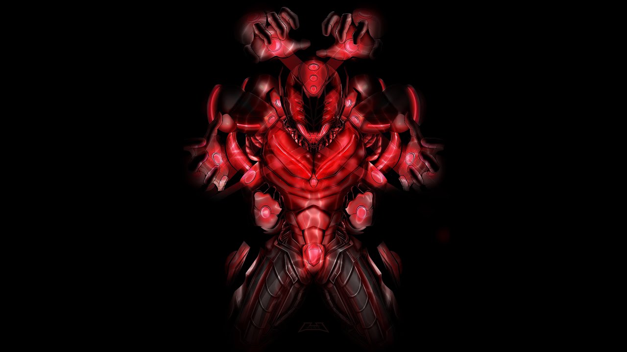
Rise of Ultron

Rise of Ultron

Poster Art developed in light of the upcoming 2nd Avengers Movie “Age of Ultron” based on the Graphic Novel/Comic. A speed paint was developed to accompany the work so that process steps can be seen as well.

Green Kill Zone

Green Kill Zone

Green Kill Zone was developed as a themed 90’s video game character piece. The story is that Eggman/Robotnik convinces Starfox, Sparkster, Pikachu, and Zero to kill Sonic for some reason unbeknownst to us. The piece is built on vantage points and perspective, mixed with quite a bit of foreshortening.

The Last Dragon

The Last Dragon

This project began as a coordinated effort and sponsorship where 5thGM developed advertising and marketing collateral for the 30th Anniversary Celebration of “The Last Dragon”. This screening will take place on November 8th 2014. It is an extraordinary huge event hosted by the Urban Action Showcase and Expo, dedicated to improved exposure and celebration of minorities in the action genre. This encompasses film, comics, animation, etc, for both male and female. This will be updated with more material as the date approaches and will conclude in a full set of marketing and advertising material created for the event. Enjoy!

Akuma Waveform (Evil Intent)

This project was set out with the intention of a study in contour and maintaining form while suggesting both waveform and frequency via lines that appear elevated from the page. A speed paint was developed to showcase the development process. Poster print available at KMA Store. Iphone and Pillowcase options available at Society6.


Better in Black

Better in Black

A series of logotype, iconography, and monogram work done for various clients, based solely off of a monochromatic black and white color palette.

Gnosis

Gnosis

Gnosis is a vector illustration art piece developed for the 14th Intrinsic Nature Experiment. The image represents a forgotten age of enlightenment. Poster print available via KMA Store. Tote available at Society6.


Ravenwood

Ravenwood

Ravenwood was a creative storyline and visual concept created for Hair Stylist Egypt Buck. Full creative control was given to convey a concept that would build a fantasy world and background story, allowing the sculpting and development of hairstyles to be the centerpiece. As a RAW Artist Egypt Buck ran against several other competitors and wanted to have his work stand apart and “steal the show” and as a result, Ravenwood was born. Ravenwood was a concept revolving around an “Aviary” world where darkness was in fact their life source… until they were confronted by “light”, eminating from 3 birds unfamiliar to their world, which soon began to cause decay and threaten everything in the world around them. Components: 1. 10’x8′ backdrop of Ravenwood Illustrated Dark Forest Scene 2. Hand Painted Custom Tree and Roots with flexible rooting to protrude and give eerie feel (painted with acrylic) 3. Ravenwood hand-drawn and painted typography for floor scene 4. 4 Backdrop Poles and holding clamps 5. Draping sky canopy (died with blue striations) 6. Custom Printed Ravenwood Character Illustrations (Digital Watercolor) 7. Logo representing the Ravenwood Brand You can view this content via the video below as well as the corresponding images:

Now and Forever

Now and Forever

Now and Forever was a special request piece that was to represent the personality of fiances; Fashion Designer and Stylist Vel-j-re aka Bunnie (Velarie Reddick) and Choreographer/Dancer Salahudin Nemley. The purpose was to combine Bunnie’s love for… well a Bunnie character, as well as Salah’s love for Super Heroes. The finished piece was developed in vector format as a custom Comic Book Cover representing their slated date of union as well as representing how their life starts at issue 1.

Crimson Viper

Crimson Viper

An illustration of one of Street Fighter’s famed female characters, C. Viper (Crimson Viper). Developed as poster art to be sold via KMA Store shop section (Items will be available soon).
The illustrations were created with a monotone and color variation depending on visual preference. 100% vector artwork .
More illustrations in this series coming soon! Stay tuned for a new upcoming crossover piece!

LAST-ART

LAST-ART

“LAST-ART” was a commissioned life-size poster illustration designed as a promotional piece for Lady Jenn Bocian’s upcoming “LAST” music video. “LAST” is an all female cast music video, which is loosely based on the artistic direction of the 300 films where our hero Jenn Bocian does battle with an evil queen for the hand of her “male”. An interestingly fun role reversal. The artwork was designed to represent the aforementioned concept in general terms and developed in 100% vector. A speedpaint displaying a portion of the work done can be found below.

Be sure to check out other content I have made via my shop: KMA Store


Game Day

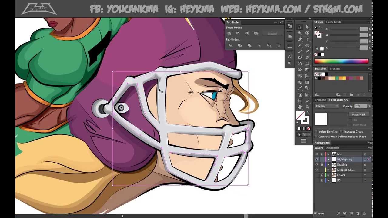
Game Day

Commissioned project: Shirt Illustration/Artwork representing one black and one white female quarterback. Goal was to maintain image of quarterbacks, sex appeal, while still being athletic/muscular.
A speed paint video was done to accompany the artwork done for commission.
Be sure to check out other content I have made via my shop: KMA Store


In Your Dreams Bub

In Your Dreams Bub

A crossover piece developed for KMA store in poster print. Features Logan (aka Wolverine) and Krueger (aka Freddy). The claw wielding adamantium infused Weapons X project vs the knife-wielding, child-killing, supernatural-psycopath!

100% vector work with no raster effects. More content soon to come!

Ghost Rider

Ghost Rider

Example piece used to teach my students in skillshare about basic steps used in order to create a vector character illustration. Class named: Rock out with Adobe Illustrator! Skills for the emerging Artist. (create an awesome vector character illustration).

Creating Character Art in Adobe Illustrator

KMA FanBoy Series

KMA FanBoy Series

The FanBoy series is the new name for the previous “Art Series” over at KMA Store (HeyKMA). The change should be rolling around spring 2014, but here are some of the original additions to the series. These items primarily represent the video game or comic book industry with a creative spin on it. Apparel available via KMA Store.


The Sarcasm Series

The Sarcasm Series

An illustrated series of sarcastic and insulting tees from the 5thGMStore 2012 line.

The Limited

The Limited

Themed shirts for the 5thGMStore LTD Series

This series was developed with the purpose of centrally focused imagery based around a theme.

1. JungleBook: Revolving around the dangers of the jungle.
2. Warfare: Revolving around the focus of war through a stylistic approach.
3. Knightfire: A dragon and knight, medievil illustrated depiction.

KMA FanBoy Chaser Collective

KMA FanBoy Chaser Collective

The Chaser Collective was a spin off of the KMA logo “Chase”. Each image is a variation of the logo in fully rendered and minimally rendered format. Developed for DTG print on clothing, Apparel is available for purchase via KMA Store.

Sharp Reality

Sharp Reality

Collaborative Gallery Showing between NayMarie Photography and 5thGM (Illustration).

Approached by Wolf Juice Shop to create a gallery of artwork to display in store, 5thGM (myself) approached NayMarie Photography and asked her to join me on a collaborative effort. The work presented was a mix of both photography and illustration dubbed “Sharp Reality”. A total of 7 pieces were created… 3 Photography based, 3 Illustrated pieces, and 1 combination Photography and Illustration piece. The Character was created around the Model “Asia Diamond” and is modeled to be an expression of aggression, sensuality, and beauty. The illustrated portions are individually titled “Crescendo, Decrescendo, and Staccato” and the final combination piece is entitled “Syncopation”. Each piece represents a different illustrative styling, inspired by eastern and western comics/animation.

The pieces were printed at sizes 20×30 (for the photography prints) and 24×36 (for the illustrated and combined piece).
Prints may be purchased via KMA Store

The Dubstep Series

The Dubstep Series

A trifecta of Dubstep inspired artwork

I decided to free design a few posters and restrict my creative inspiration to only that of Dubstep music. The three pieces which follow are a series and a result of that development.

Wolf Juice

Wolf Juice

A screen print designed illustration set based on the idea of ravenous natural instincts for sale in the Wolf Juice Brick and Mortar and Online Shops as well as accompanying Smoking Products line logo.

Creature Capture

Creature Capture

The 5thGMStore Models.

Created to rock a various set of the 5thGMStore tshirt prints found in the “Sarcasm Series”. @5thGMStore
Developed to provide a unique take on models as opposed to the traditional photo models. Vector illustration was used to replace the “typical” model.
The project was a culmination of 10 weekly releases. Each release was accompanied by a character profile and leading to the final $500 contest soon to hit the store’s site. You can also stay up to date via fb: 5thGMStore

Deep Vector

Deep Vector

A series of various vector illustration commissions with different styling and themes.

The Good Villain

The Good Villain

The Good Villain Wallpaper Series

This project was commissioned by a high level choreographer and dancer for the purposes of promoting both his new business development and an incentive for new site members.

Victoria’s Secret: IPEX

Victoria's Secret: IPEX

Campaign developed for print and web to showcase the weightless IPEX across Web, Billboard, and Magazine.

Self-Actualization

Self-Actualization

Who: http://NayMarie.com [Photography Side] – http://www.behance.net/iamnaymarie
What: 3-set digital/print ad campaign
Purpose: To showcase NayMarie Photography’s ability to bring to light the person in front of the camera in different personalities.

About NayMarie Photography
NayMarie is a professional Photographer & Retoucher based in Brooklyn, New York, specializing in creative and extreme concepts with experience in all forms of photography and image editing. Nay’s self-taught approach to photography and retouching quickly caught the attention of her clients via her vibrant photographs. Her passion for photography has attracted Nay to all different genres scaling from Products to Infants to Fashion. Most photographers feel as if they have to choose one genre and stick to it, but Nay believes her love for being behind the camera should have no bounds. Every photograph that comes across nay’s desk is treated as Captured Art. “Captured Art” is just that… captured art. Being innately an artist, I approach every photoshoot and every retouching project creatively. My goal is always to give my clients photos that they will be proud to have publicly displayed. -NayMarie Whether the project is for promotion, publication, advertisement, or simply personal gratification, the destination of NayMarie’s photo journey is always Captured Art. View her blog for more insight into the inner workings of NayMarie! http://www.NayMarie.com/photography/captured-art “Captured Art”

Playful Faces

Playful Faces

A full rebranding and building of the Playful Faces Face and Body Painting image. A dichotomy of two target markets and campaigns developed to attract both.

The full development of Playful Faces web and print presence is developed by 5thGM. View their website here: http://PlayfulFaces.com

UDL

UDL

A series of Advertisements completed for the Branding of the UDL (Urban Dance League *originally “Look Who Came to Dance”*) a competitive sports league for hip hop dancers. A development of a unique logo was necessary to stand against those found in other competitive sports entertainment.

Webwork

Web

Various websites developed over time for a series of clients. Each client listed deals in a specific niche within their respective industries.

Time Travel Muziq

Time Travel Muziq

A 3D rendered and animated video intro developed with the theme of a never ending spiral that is also a record player becoming overpowered, exploding, and then imploding. Based on original Time Travel Muziq logo development.


Circuit of Change

Circuit of Change

A 3D rendered and animated video intro developed for Circuit of Change based on their current logo. Design was commissioned with the purpose to show interconnectivity of the CoC community.


Ladies Get Down

Ladies Get Down

A music video reel compiled for Robin Dunn’s “Ladies Get Down” which showcases various resume/reel works from the participating choreographers being celebrated.


Saint Delivery

Saint Delivery

A 3D rendered and animated cube designed to represent the Cooper Union Cube in Manhattan as a part of an associative identity for a boutique food delivery company.

TUMT

TUMT

An animated intro developed for TUMT NYC.
Privacy Settings
We use cookies to enhance your experience while using our website. If you are using our Services via a browser you can restrict, block or remove cookies through your web browser settings. We also use content and scripts from third parties that may use tracking technologies. You can selectively provide your consent below to allow such third party embeds. For complete information about the cookies we use, data we collect and how we process them, please check our Privacy Policy
Youtube
Consent to display content from - Youtube
Vimeo
Consent to display content from - Vimeo
Google Maps
Consent to display content from - Google